Modernized Document Service

The first UI/UX update to the digital documents service in over ten years
Project Overview
Role: Lead UX Designer and Researcher
Team: 2 Product Managers, 1 Lead Engineer, 1 Designer
Timeline: Q1 - Q4 2024
Tools: Figma, Mural, UserZoom
In 2024, I led the end-to-end design strategy and execution of modernizing our digital document viewing and retrieval service across both our mobile app and website.
The goal: Reduce friction, align with user expectations, and decrease support call volume related to document access.
Problem space
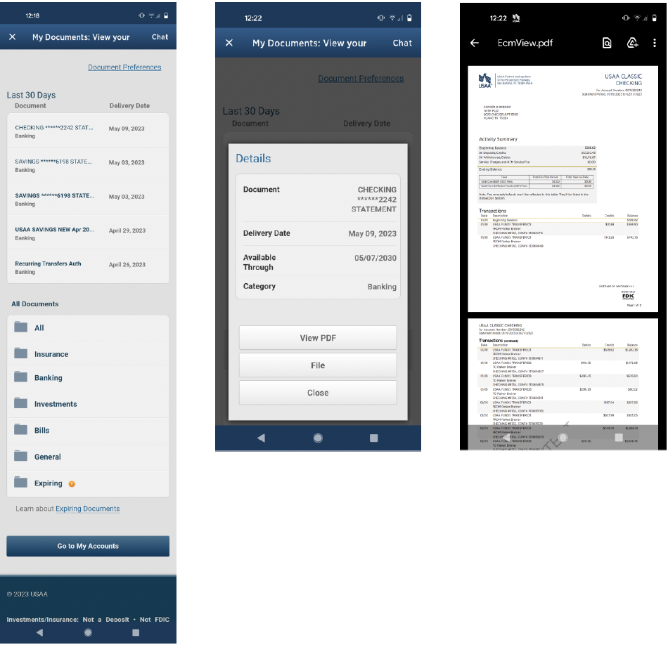
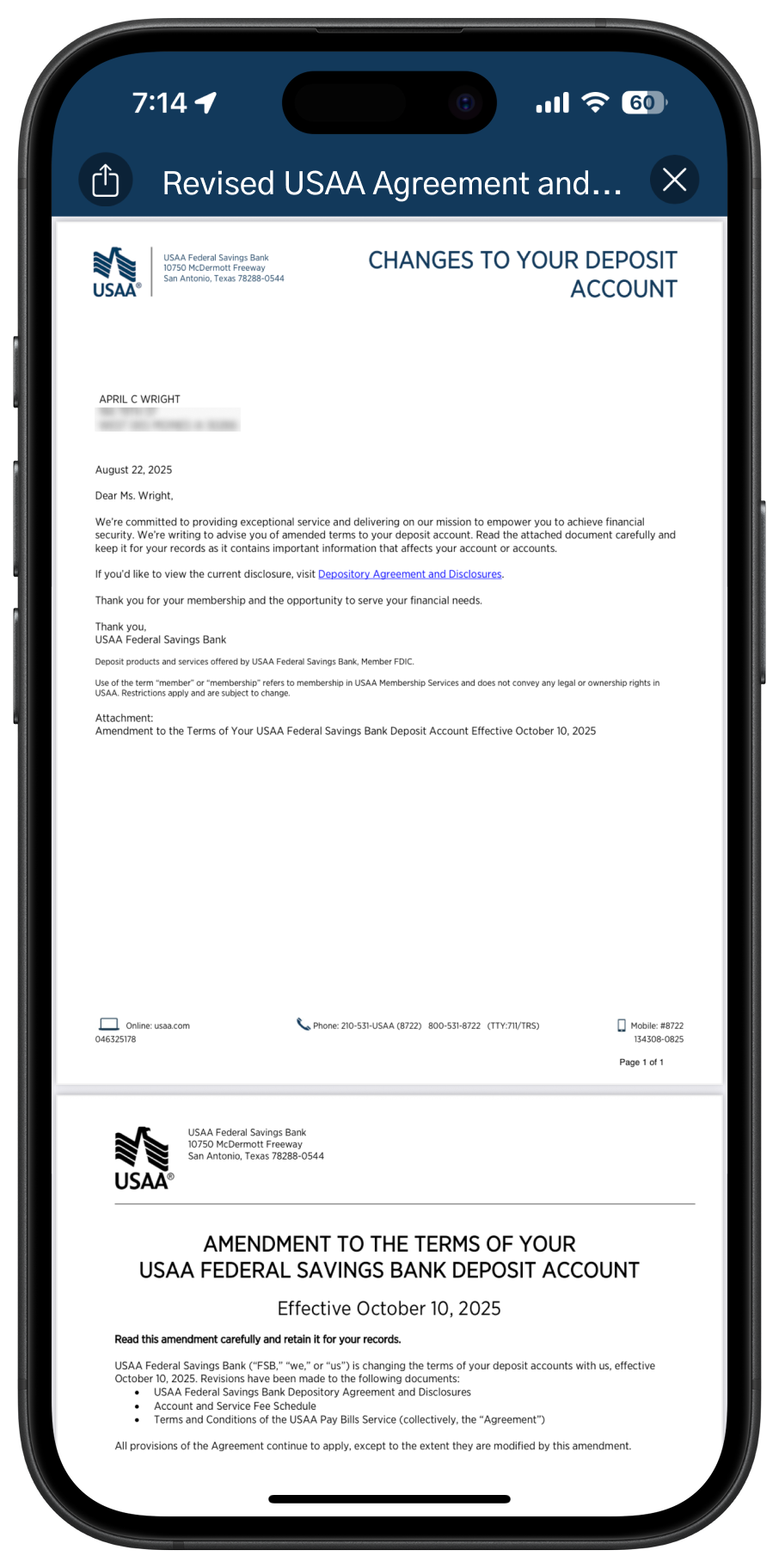
Mobile web views of legacy document service
Business Context
The old document center was troublesome because of its outdated design, inconsistent interactions on different platforms, and folder system that didn’t match how users searched for documents. Leadership saw this as a chance to boost member satisfaction and lower costs.
User Problem
Members struggled to locate and view their documents due to
A non-intuitive folder structure
Lack of search functionality
Unhelpful filters
Excessive steps to view a document
Notifications that didn’t link to the relevant document
Approach
Discovery & Research
To uncover user needs and pain points, I used a multi-method research approach:
Usability Tests (baseline of current experience)
Surveys (quantitative pain point validation)
Card Sorts and Tree Tests (to evaluate and reimagine the information architecture)
Competitive Analysis (to benchmark against modern financial and insurance platforms)
Market Study (to understand industry best practices and future trends in digital documents and communication)
Key Insights
The current folder structure didn't match how users think.Users took too long to find documents.
Filters made things more confusing.
Notifications were frustrating because they didn’t link directly to the right content.
Accessing documents involved too many steps and extra choices.
Strategy & Planning
To define the project scope, I worked with product and engineering teams to review past research, find key member issues, and check technical limits.
We compared effort to impact and agreed on a realistic MVP that fit our short timeline.
Using research, member quotes, and competitor examples, I helped prioritize features and pushed to remove outdated functions that didn't help users.
This data-driven approach changed the product focus but also highlighted where we did not agree, especially about keeping old features.
We created a project roadmap and MVP board in Mural to guide early planning. As the project grew, this board became hard to update, and our team has since implemented better project management tools.
I collaborated closely with engineers to manage these technical limits:
Search and filters were limited by backend systems
Legacy titles and account names couldn’t be changed in the MVP
Only PDF files were supported
To ensure long-term scalability, I designed within our system's design standards and created low-fidelity concepts for future enhancements post-MVP—laying the groundwork for a more robust and flexible document experience down the line.
Design Process
We replaced the old folder system with a live document list. This matched how users think by allowing filters by document type and account, and made it faster to access documents with fewer taps or clicks.
I designed several mobile prototypes that helped show the design clearly to stakeholders and executives, demonstrating flow and consistency.
Later, we found technical limits:
Document titles couldn’t be changed, which affected clarity
Documents couldn’t be sorted by type because of metadata limits
Despite challenges, I quickly revised the designs to meet our limits while keeping user value. The solution was created for mobile first, then adjusted for web. I used our design system for consistent visuals and efficient development, working closely with QA and accessibility teams to meet platform standards. To ensure agreement and confidence, I presented the entire process—from old problems and research to tested design solutions and a proposed MVP plan. Stakeholders from legal, business, engineering, design, and digital communications reviewed the work to agree on the direction and execution.
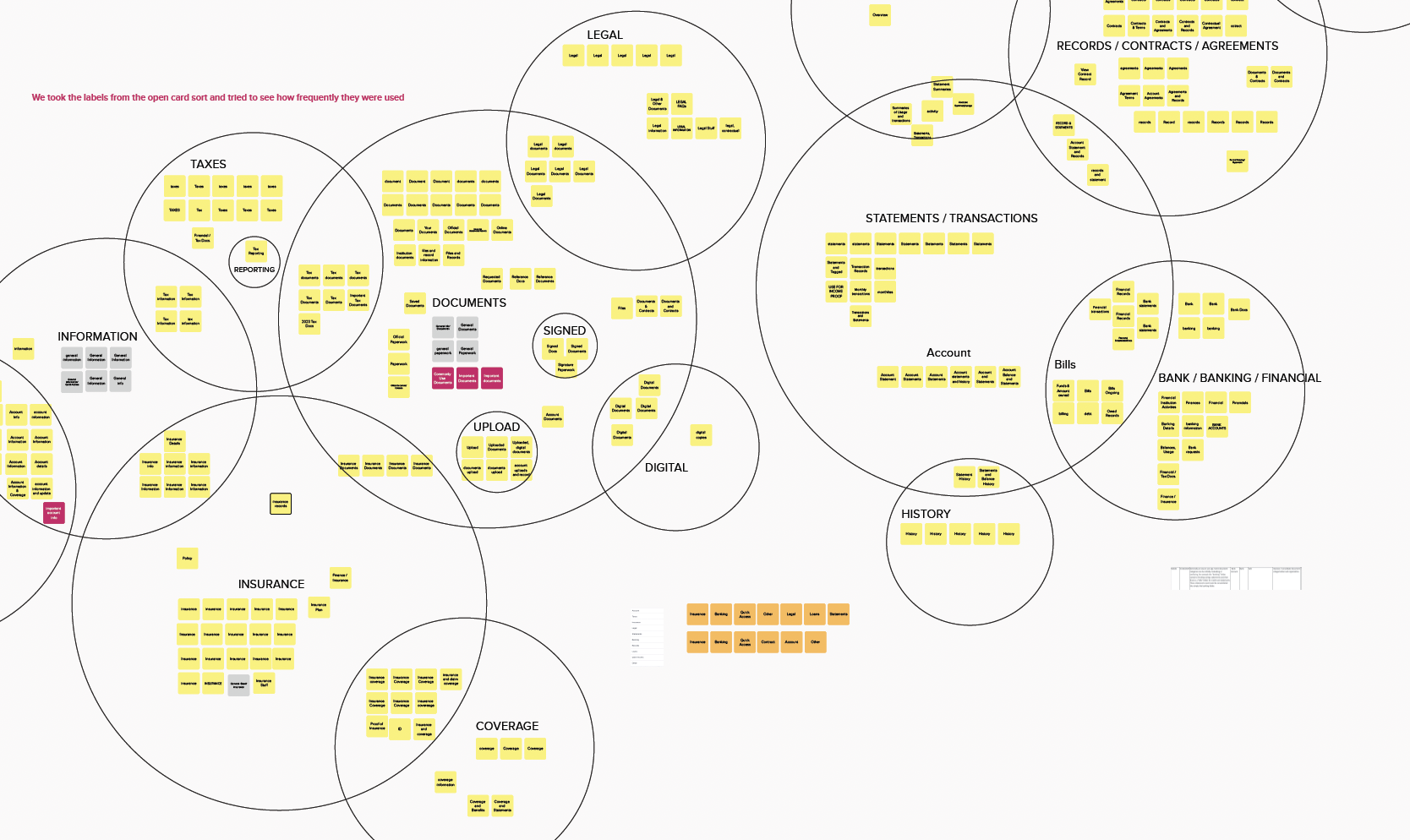
Synthesis of card sort test for information architecture
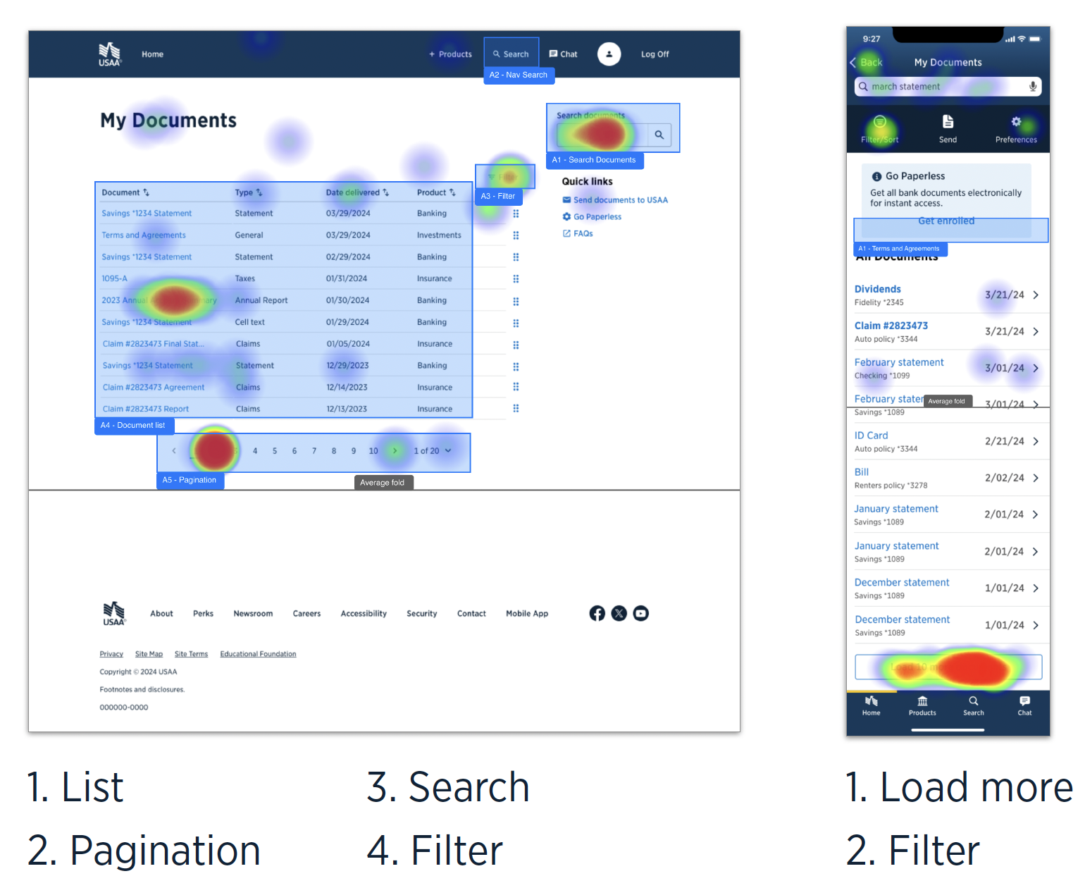
Usability test for search and filter abilities
comp. analysis? roadmap mural,
prototype quicktime?
Results
Final Solution
Describe the final product or experience
Before/after visuals (optional, I can help format)
Highlight systems thinking or interaction design
Results & Impact
Any data/results post-launch?
Stakeholder or user feedback?
What changed for the business or user?
Reflection
What did you learn?
What would you do differently?
Any notable challenges you overcame?
stats? before/after? future?